What Is the Most Masculine Color? Psychology, Palettes, and How to Use It
- Cleo Fairchild
- 8 September 2025
- 0 Comments
Ask ten people what the most masculine color is and you’ll hear “blue” on repeat. Yet when you look at how we actually dress, design brands, and judge uniforms, a different color quietly wins. If you want a straight answer and a practical way to use it-without getting trapped in stereotypes-you’re in the right place. I’ll give you the evidence in plain English, then show you how to choose a masculine color that works for you, your wardrobe, your brand, or your home.
TL;DR: The quick answer, backed by evidence
- The short answer: Black is the most widely perceived masculine color in real-world contexts-suits, uniforms, luxury branding, and tech-because it signals authority, strength, and formality. In style and sport psychology, black consistently reads as powerful and intimidating.
- Close runners-up: Navy and charcoal. They carry the same authority as black but feel more approachable for daily wear and corporate settings.
- Bold exception: Red signals dominance and high energy. Studies show red boosts perceptions of power and can influence competitive outcomes, but it’s high-risk if you overdo it.
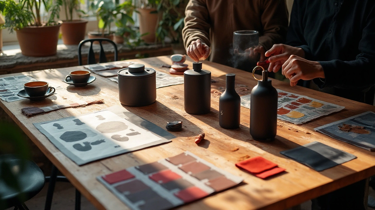
- The rule that matters more than hue: Darker value and cleaner (less muddy) saturation read more masculine. A deep green, burgundy, or espresso brown can be as masculine as black when the value is low (dark) and the finish is matte.
- Use it smartly: For clothes, think 60-30-10-base (navy/charcoal/black), secondary (olive/dark brown), accent (red/metal). For brands and interiors, control contrast and texture-matte, grain, and metal accents boost the masculine feel.
Why black? Multiple strands of research point the same way. Frank and Gilovich (1988) found teams in black uniforms were judged more aggressive and got more penalties-because black cues dominance. In business dress studies, darker suits increase perceived authority and competence. In consumer psychology, black packaging signals premium and power; luxury categories lean on it for that reason. Meanwhile, surveys like YouGov’s UK colour preference poll show blue as the most “liked” color, but “most liked” isn’t the same as “most masculine in effect.” That’s the gap this guide closes.
One more thing: there’s no single color that works for every face, brand, or room. So I’ll give you a simple method to pick your version of a masculine palette that suits your skin tone, your message, and your setting.
By the way, if you’re skimming for the keyword: the most masculine color in practice is black-followed closely by navy and charcoal-while red functions as a potent, situational accent.
How to choose your masculine color (step-by-step, no fluff)
Use this five-step workflow to pick a masculine color that actually works in your life. You can run it for a wardrobe, a brand, or a room.
- Define the vibe, not just the hue.
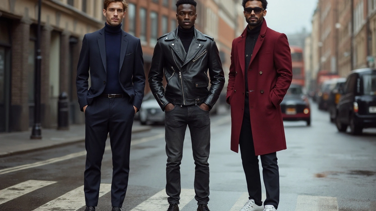
- Authority and polish: black, charcoal, navy.
- Rugged and grounded: dark olive, forest green, tobacco brown, navy denim.
- Bold and competitive: red (crimson, oxblood), with restraint.
- Modern minimal: graphite, slate, off-black, deep taupe with steel accents.
- Pick the hue family, then push value darker.
- Masculinity reads strongest when the value is low (darker). If you like green, choose forest or racing green, not mint. Love blue? Go navy or ink, not sky.
- Rule of thumb: if a color looks good at dusk and still reads solid, you’re in the right value range.
- Control saturation and finish.
- Clean, saturated darks feel decisive. Muddy, gray-brown mid-tones often look tired.
- For clothing: matte and textured finishes (wool, suede, raw denim) read more masculine than high-shine synthetics.
- For brands/interiors: pair matte darks with brushed metal or natural wood. Avoid too much gloss unless you want an overtly flashy vibe.
- Fit it to your skin tone or context.
- Fair/cool skin: navy, charcoal, ink blue, cool forest green. Black can look stark-buffer with texture or softer contrasts (charcoal over jet black).
- Medium/warm skin: espresso, tobacco, olive, oxblood, navy. Black works, but try off-black or deep charcoal for softer contrast.
- Deep skin: black, oxblood, cobalt-navy, bottle green. You can carry higher contrast and bolder reds without looking overwhelmed.
- Corporate vs. creative: in conservative settings, lead with navy/charcoal. Creative settings can handle black-on-black or bold red accents.
- Build a palette with the 60-30-10 rule.
- 60% base (navy/charcoal/black). 30% secondary (olive/dark brown or graphite). 10% accent (red, metal, or white).
- For wardrobes: shoes and belts live in the 30% slot; pocket squares, watches, and ties live in the 10% slot.
- For brands: background is 60, typography or secondary blocks 30, accent for CTAs 10.
Common pitfalls to avoid:
- Confusing “favourite color” with “masculine effect.” People say they like blue; they signal power with black, navy, and charcoal.
- Going all-in on red. Red is potent in small doses. Overdo it and it skews aggressive or flashy.
- Using the wrong finish. A glossy black jacket can look cheaper than a matte charcoal coat. Texture matters.
- Ignoring lighting. A charcoal that looks rich under shop lights can turn flat at home. Test in daylight.
Quick decision tree (mental model):
- Need maximum authority? Choose black for evening/formal; charcoal/navy for daytime.
- Want masculine but relaxed? Choose dark olive or chocolate brown as your 30% secondary.
- Want a confident pop? Add a single red accent (tie, pocket square, logo mark, cushion).
- Hate black on your face? Use black below the waist (trousers, shoes) and put navy/charcoal near your face.
Real-world examples, palettes, and what actually works
Here are practical ways to put masculine color to work-whether you’re dressing for a job, building a brand, or setting up a flat.
Wardrobe: suits and daily wear
- Interview or boardroom: charcoal suit, white shirt, black or oxblood shoes, steel watch. Accent with a navy tie for authority or a small red detail for presence.
- Smart casual: navy field jacket, dark denim, brown boots, grey knit. Swap the knit for olive to tilt rugged.
- Evening: black jeans or tailored trousers, black or charcoal knit, leather boots. If black near your face is harsh, wear ink navy on top and keep black on the bottom.
- Summer masculine: stone chinos with a navy polo, brown belt, and dark sunglasses; or olive shorts with a charcoal tee and white sneakers. Keep the value darker up top.
Palette ideas (hex for clarity):
- Authority: #0A0A0A (Off-Black), #2B2B2B (Charcoal), #0F2742 (Ink Navy), #B4002D (Crimson Accent), #C0C5C9 (Steel)
- Rugged: #25312A (Forest), #3F2E1E (Tobacco), #2B3A67 (Workwear Navy), #8E2A2A (Oxblood), #8A8F94 (Gunmetal)
- Minimal: #1C1C1C (Graphite), #4B4F53 (Slate), #E8E8E8 (Soft Grey), #A67C52 (Brushed Bronze), #FFFFFF (White)
Branding: logos, packaging, and websites
- Tech premium: black/graphite base, white text, single red CTA. Use a brushed metal texture or subtle noise in the background to avoid flatness.
- Heritage/outdoors: deep green, dark brown, cream, and off-black ink. Letterpress or grain elements add authenticity.
- Modern direct-to-consumer: navy base, slate secondary, electric red or signal orange accent. Keep the accent under 10% of the page.
Interiors: a room that reads calm and masculine
- Living room: charcoal wall, oak or walnut wood, black metal fixtures, cream rug, oxblood leather chair as the single bold moment.
- Bedroom: ink blue wall, slate bedding, black side tables, bronze lamp. One red book spine or artwork is enough.
- Kitchen: matte black cabinets, wood worktops, stainless hardware. Add dark green plants for life without losing the vibe.
Evidence snapshot (so you’re not taking this on faith):
• Frank & Gilovich (1988) showed black uniforms increased perceived aggression and penalties-black cues dominance and power.
• Hill & Barton (2005) studied Olympic combat sports; athletes in red had higher win rates when skill was evenly matched-red signals dominance.
• Elliot & Niesta (2008) found red increased perceived attractiveness and status in controlled experiments-again, potent but context-sensitive.
• YouGov’s UK colour preference polling consistently puts blue as the most popular color, across genders-but popularity ≠ masculine impact. Luxury packaging research shows black signals premium positioning and authority, which is why high-end brands lean on it. Pantone’s annual trend reports show recurring deep blues and charcoals for sophistication in men’s fashion.
| Study/Source | Context | Color Finding | Practical Takeaway |
|---|---|---|---|
| Frank & Gilovich (1988) | Sports uniforms | Black linked to higher perceived aggression and penalties | Black projects power; use for authority or intimidation |
| Hill & Barton (2005) | Olympic combat sports | Red associated with higher win rates when skill is equal | Red is a strong accent for competitive moments |
| Elliot & Niesta (2008) | Attraction/status experiments | Red increased perceived attractiveness and status | Use red sparingly to boost presence |
| YouGov UK (multi-year) | Public color preferences | Blue most liked across genders | Blue is safe and versatile; navy is a daily masculine base |
| Luxury packaging research | Retail/branding | Black signals premium and power | Black/graphite anchors masculine brand identities |
Trend note for 2025: menswear in the UK leans into ink blue, charcoal, racing green, and oxblood accents. Suiting softens with texture (flannel, hopsack) while sneakers go clean white against darker outfits. In interiors, matte black hardware and deep green walls keep trending, with warm woods balancing the palette.
Cheat sheets, quick checks, and your next steps
Short on time? Use these one-glance guides.
Quick picks by scenario
- Interview: charcoal suit, white shirt, navy tie, black shoes.
- First date: ink navy shirt, black jeans, oxblood boots, steel watch.
- Presentation: navy blazer, charcoal trousers, white pocket square, tiny red accent.
- Casual weekend: olive overshirt, grey tee, dark denim, brown boots.
- Evening event: black trouser, charcoal knit, leather jacket, keep the rest minimal.
Wardrobe palette formulas
- Formal capsule: black/charcoal base (60), navy secondary (30), white/silver accents (10).
- Smart rugged: navy base (60), olive/brown secondary (30), oxblood/bronze accents (10).
- Summer masculine: navy base (40), stone/khaki (40), dark leather + red accent (20 split).
Brand palette formulas
- Premium tech: graphite (60), white (30), signal red (10).
- Heritage craft: bottle green (50), off-black (30), cream (15), copper (5).
- Fitness competitive: black (50), steel (30), red/orange (10), white (10).
Checklist: does your color read masculine?
- Is the value dark enough? (Keyword: low value.)
- Is the finish matte or textured, not plastic-glossy?
- Is the saturation clean, not muddy?
- Do you have contrast control (one bold accent only)?
- Does it suit your skin tone or room light?
Pitfalls and fixes
- Black washes you out: switch to charcoal near your face; keep black on trousers, belt, shoes.
- Red feels too loud: try oxblood or deep burgundy; same energy, less shout.
- Brand feels harsh: lighten 10-15% of the base value, or swap jet black for graphite.
- Room feels gloomy: add warm wood, cream textiles, and a single metallic accent.
Mini-FAQ
- Is black or navy more masculine? Black reads as the most dominant; navy is more wearable and friendly. For daily authority, navy wins on practicality.
- Does red count as masculine? Yes-in accents. Research links red with dominance and attention. Use it sparingly for impact.
- What about pink? Dusty rose or salmon can look great with navy/charcoal. Masculinity is more about value, context, and contrast than banning hues.
- Best suit color for interviews? Charcoal or navy. They signal competence without feeling severe.
- Masculine colors for summer? Keep darker value up top (navy polo) with lighter neutrals below (stone chinos). Add brown leather for weight.
- Are cultural differences real? Yes. Some cultures associate white with mourning, others with purity; red can mean luck or danger. When in doubt, lean on navy/charcoal/black-they’re globally safe.
- Do fabrics change the read? Completely. Wool, denim, suede, and matte leathers skew masculine; shiny synthetics can cheapen a strong color.
Next steps
- Build a two-week uniform: pick a base (navy or charcoal), a secondary (olive or brown), and one accent (red or metal). Repeat the combo across outfits.
- Color test at home: stand by a window, hold up two options (black vs. charcoal, navy vs. ink). Keep the one that makes your face look sharper and your eyes brighter.
- Brand sanity check: print your palette on matte paper and view on a phone in dark mode. If it still looks clear and confident, you’re set.
- Room mock-up: paint an A3 board with your chosen wall color. Move it around for two days. If it only works at noon, adjust the value down.
Troubleshooting by persona
- Corporate professional: if black suits feel too formal, wear navy suit + black shoes + steel watch. You keep the authority without the severity.
- Creative founder: use black/graphite for your deck and wardrobe, but add a signature accent (crimson or copper) to stand out on stage.
- Student or budget: focus on three pieces-navy jacket, dark denim, brown boots. Everything else plugs in.
- Small flat renter: charcoal soft furnishings (curtains/throws), black metal lamp, one oxblood cushion. No paint needed to shift the vibe.
Bottom line: if you need a single, reliable answer for masculinity in color, choose black-and rotate navy and charcoal for range. Then add one accent with intent. That’s the formula that holds up in the office, on the street, on screen, and at home.