Color Palette: Your Shortcut to Smarter Style Choices
When talking about color palette, a set of colors that work together in a design or outfit. Also known as colour scheme, it helps you create harmony, avoid clashes, and express mood through clothing. A well‑planned palette saves time when you shop, lets you mix pieces confidently, and makes every look feel intentional.
Why Color Psychology Shapes Every Palette
Understanding color psychology, the study of how colors affect feelings and behavior is the first step to picking a palette that fits the occasion. Warm tones like red or orange boost energy, while cool blues calm nerves. When you know the emotional impact, you can choose a palette that matches your vibe—whether you need confidence for a presentation or relaxation for a weekend brunch. This link between mood and hue explains why brands obsess over palettes and why your outfit can change the way people perceive you.
Another key insight is that a palette isn’t static; it evolves with trends and personal taste. By blending classic neutrals with a pop of an emotionally charged color, you create depth and keep your look fresh without overhauling your whole wardrobe.
When you factor in masculine color, hues traditionally associated with strength and authority, like navy, charcoal, and deep reds, you add another layer of meaning. Men’s fashion often leans on these tones to convey professionalism, while women can use them to add edge to a feminine outfit. Mixing a masculine shade with a softer palette creates contrast, making a simple shirt stand out or softening a bold statement piece.
One practical way to use masculine colors is to anchor a bright palette with a dark base—think a navy blazer over a pastel shirt. The dark element grounds the look, while the brighter pieces add personality. This balance works for both office environments and casual outings, proving that masculine hues aren’t limited to formal settings.
Matching tees to jeans is a daily challenge that becomes easy once you treat it as a mini‑palette. t‑shirt colors, the shades you choose for shirts that sit against denim follow simple rules: neutral tees (white, gray, black) pair with any wash, while colored tees need a complementary or contrasting denim shade. A deep burgundy tee looks striking with light‑blue denim, whereas a mustard top pops against dark indigo. By viewing each combination as part of a broader color palette, you avoid random pairings and instantly improve outfit cohesion.
Beyond basics, you can play with seasonal palettes—earthy tones in autumn, bright pastels in spring—to keep your wardrobe aligned with nature’s cycles. This approach also helps you shop smarter, as you’ll know which new pieces will blend with existing ones.
All these ideas—color psychology, masculine hues, and tee‑jean matching—show how a thoughtful color palette turns everyday dressing into a strategic, enjoyable process. Below you’ll find articles that dive deeper into each angle, from choosing the perfect summer palette to decoding what a brown t‑shirt says about you. Explore the collection and start building palettes that work for every occasion.
- Cleo Fairchild
- Jan, 26 2025
- 0 Comments
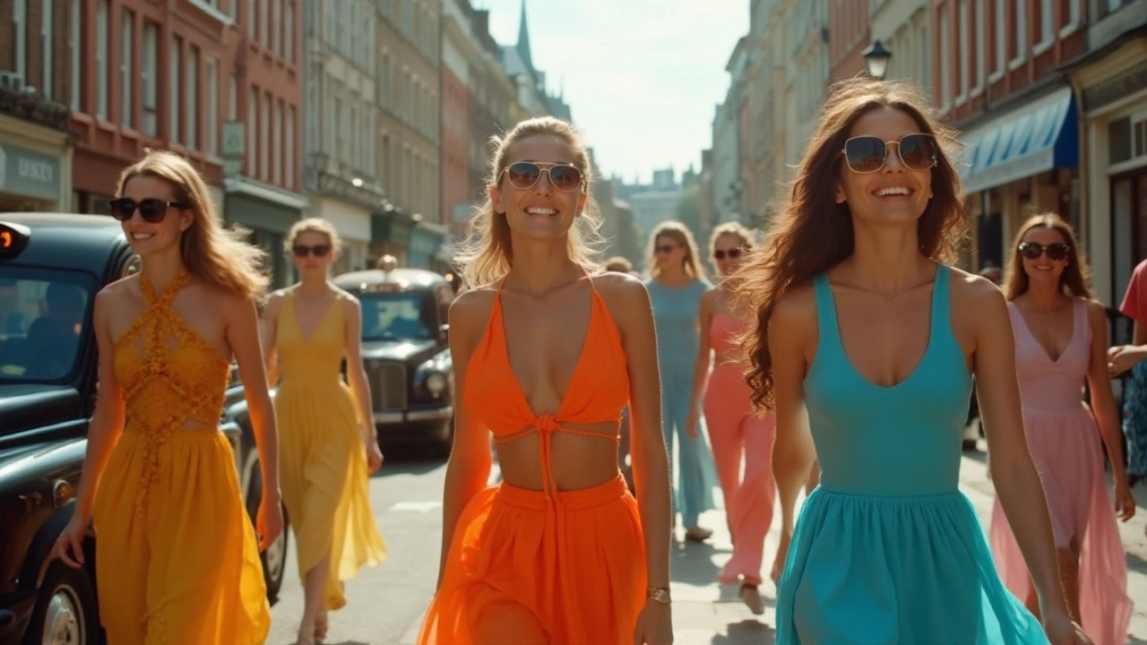
Vibrant Summer Dress Color Trends for 2025
As the sun graces us with its warm embrace, delve into the captivating world of summer dress colors for 2025. Discover the hues that will turn heads and lead the season, ranging from bold and bright to soft and serene. Whether you’re looking to make a statement or embrace subtle elegance, these color trends will inspire your wardrobe and keep you on the cutting edge of fashion. With tips on how to mix and match, you're equipped to take the summer by storm with your vibrant ensemble.